
Add description, images, menus and links to your mega menu
A column with no settings can be used as a spacer
Link to your collections, sales and even external links
Add up to five columns
Add description, images, menus and links to your mega menu
A column with no settings can be used as a spacer
Link to your collections, sales and even external links
Add up to five columns

Understanding Color Profiles: CMYK vs RGB vs Pantone vs Hex
July 28, 2025 4 min read
Color profiles can be confusing, even for designers. If you’ve ever sent a file off for printing and thought, “Wait… that red looked way brighter on my screen,” you’re not alone. The way that colors appear on your screen is not always the way they’ll look once printed.
In this post, we’ll break down the difference between CMYK, RGB, Pantone (C and U), and Hex—so whether you’re ordering roll labels, stickers, hats, tee shirts, waxed paper, postcards, or anything else we offer, you’ll know what to expect.
If you’re in a rush or don’t want to mess with color conversion, just send your artwork to us at TM Impressions. We’ll make sure everything is dialed in for print and send you a proof to approve before anything gets produced.
CMYK – What You See Is Not What You Get
CMYK stands for Cyan, Magenta, Yellow, and Key (Black). These four inks combine during the printing process to create most printed colors.
If your artwork is going to be printed, it needs to be in CMYK color mode. RGB files (which we’ll get to in a second) often look brighter on screen, but once printed, they’ll appear dull or completely off unless they’re converted properly. This affects some colors more than others (like reds for example).
Pro tip: If you’re using Adobe Illustrator or Photoshop, you can check and change your color mode by going to:
File > Document Color Mode > CMYK Color
Our other post on creating vector art files here may also be useful for you.
RGB: Made for Screens, not for Print
RGB stands for Red, Green, and Blue, and it’s how your computer screen displays color. This mode is perfect for anything digital, like websites, social media, or online ads, but not for print!
Why? Because RGB has a much wider range of visible color than CMYK. That’s why your bright neon green might look awesome on your phone, but a bit dull on your printed label. Most RGB files are also viewed on screens that have backlighting vs a printed item that depends on the light around it to show colors.
If you’re sending us a file in RGB, we’ll convert it for you, but just know that some colors won’t match exactly, especially bright or saturated hues. Sometimes we can adjust the colors a bit to help and as always, we'll send you a proof/mock-up before starting production.
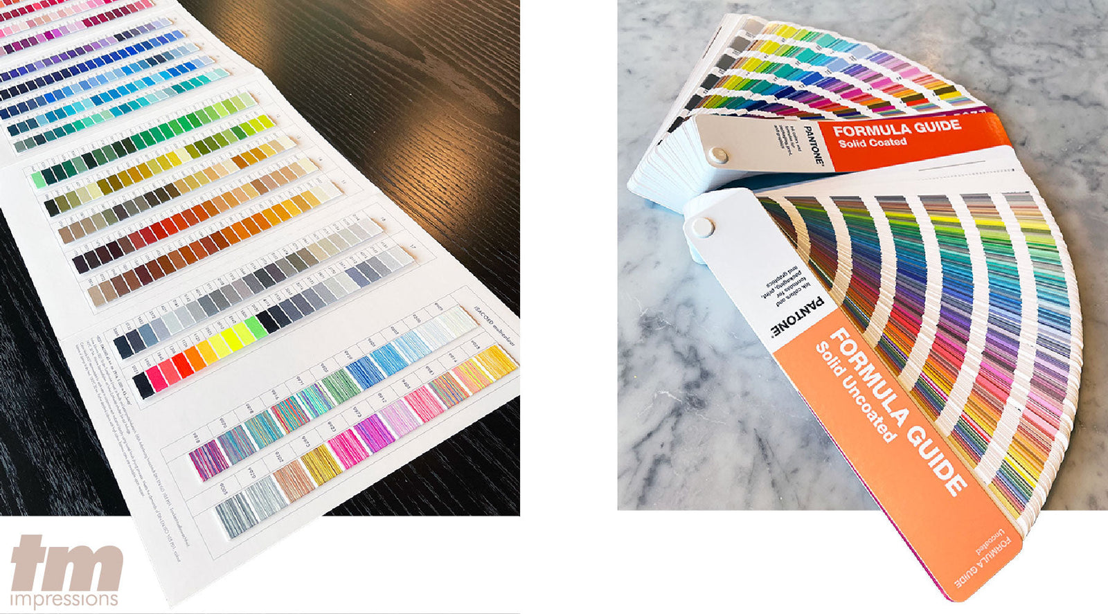
Pantone : The Color Bible (With a Catch)
Pantone colors are pre-mixed ink colors, each assigned a unique code. Think of it like the paint swatches you see at Home Depot, but for printing. Here is a link to the Pantone Color Finder that may be useful to you.
Pantone colors are great when:
You need color to be 100% consistent across multiple items
You want a very specific shade that’s hard to hit with CMYK
You’re printing solid spot colors (like on a logo or brand color)
Pantone C vs Pantone U:
C = Coated paper (think glossy postcards, also tee shirts)
U = Uncoated paper (like stationery, waxed paper, or paper to-go bags)
Even though the color number might be the same (e.g. Pantone 185), it will look different depending on whether it’s on coated or uncoated stock. That’s why we always ask what kind of material you're printing on before we match a Pantone. Sometimes the U and C code are the same number and are compatible, but sometimes we need to adjust to a different Pantone number if we're going from C to U or vice versa.
Note: If your Pantone color has a dash in the number, like Pantone 14-0852 TCX, that’s part of Pantone’s Fashion, Home + Interiors system (sometimes labeled as TCX or TPX). These are made for textiles, paint, and interior design, not for standard printing.
We can try to match those visually, but there’s no direct CMYK or screen-printing equivalent. If you’re aiming for print, try to use a Pantone Solid Coated (C) or Uncoated (U) color instead.
Hex Codes – For Web Only
Hex codes (like #FF5733) are used for digital design only. These six-digit codes tell websites what color to display, but they don’t mean anything to a printing press. If you send us a logo and say “Use this hex code for the red,” we’ll do our best to match it in CMYK—but just know that hex and CMYK are not 1:1 conversions.
Bonus: What About Embroidery Colors?
Embroidery uses threads, not ink. So color matching works a little differently.
Most commercial embroidery machines use Isacord thread, which has its own set of color codes (like Isacord 1900 for bright red). These aren’t the same as Pantone or CMYK and there’s no perfect match between them.
If you send us a Pantone color, we’ll do our best to find the closest Isacord equivalent, but embroidery will always have a bit of variation since threads reflect light differently than ink on paper or fabric. Here is a conversion chart in case it's helpful for you.
Still not sure? No problem.
If your file has the wrong color mode, or if you're not sure what Pantone color your brand uses, don’t stress. We handle this stuff every day. Just send us what you have and we’ll make sure everything prints correctly.
Whether you’re printing labels, shirts, postcards, waxed paper, or anything else, we want the final product to look exactly how you imagined it.
Shoot us a message and we’ll be happy to help :)
Subscribe
Sign up to get the latest on sales, new releases and more …